Bureau Hardy Seiler
• Corporate • Editorial • Graphic • Web Design
Work
About
Donation Campaign
Say Hello
Bureau Hardy Seiler
• Corporate • Editorial • Graphic • Web Design
Work
About
Donation Campaign
Say Hello
Work
Objects
Editorial Design, Logo Design
Schwarz zu Blau
Branding, Logo, Stationery, Website
Reframing Innovation
Editorial Design, Logo Design
Digital Pioneers
Editorial Design
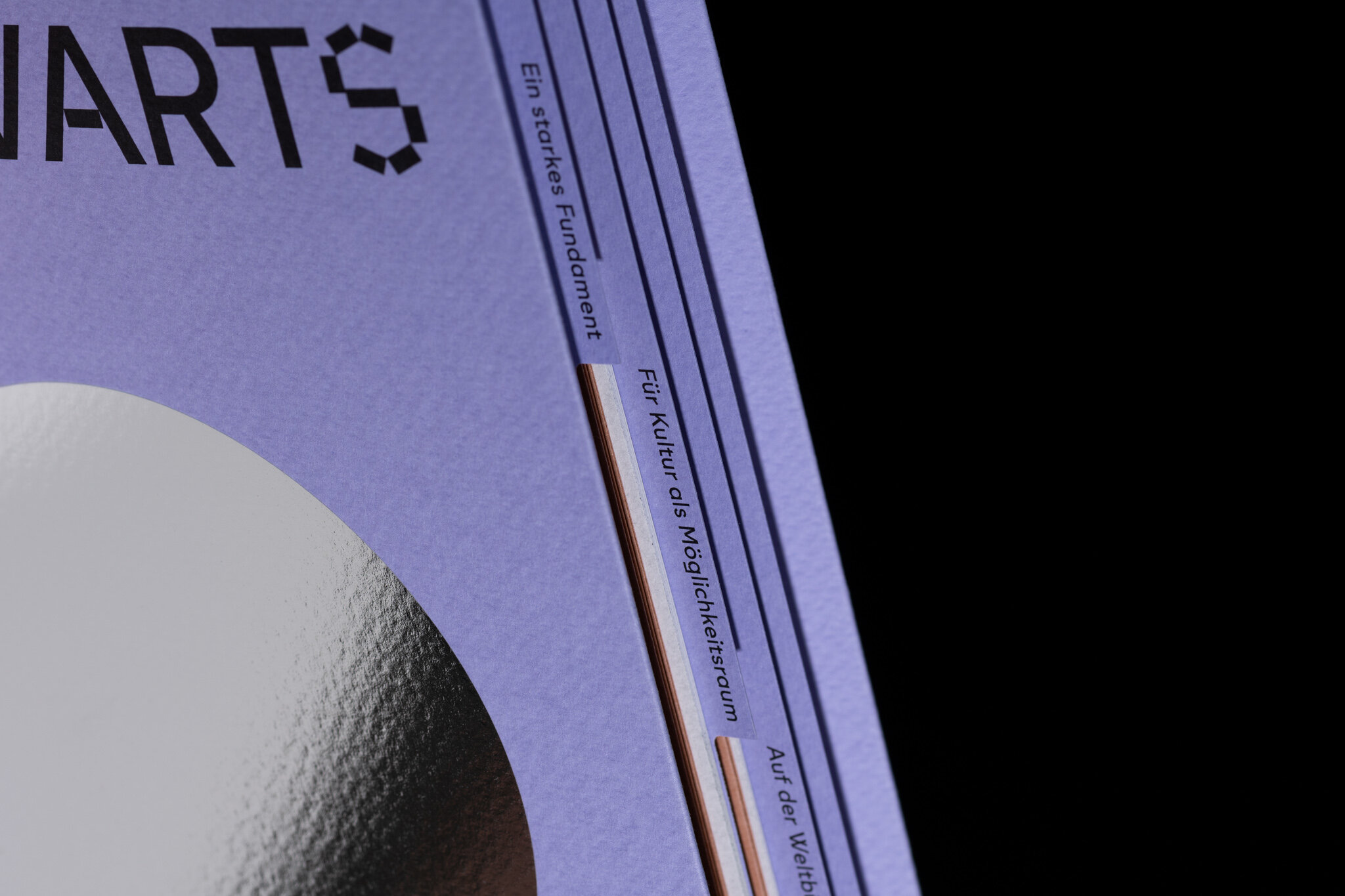
Vorwärts nach weit
Editorial Design
Daiku San
Corporate Design, Stationary Design, Website
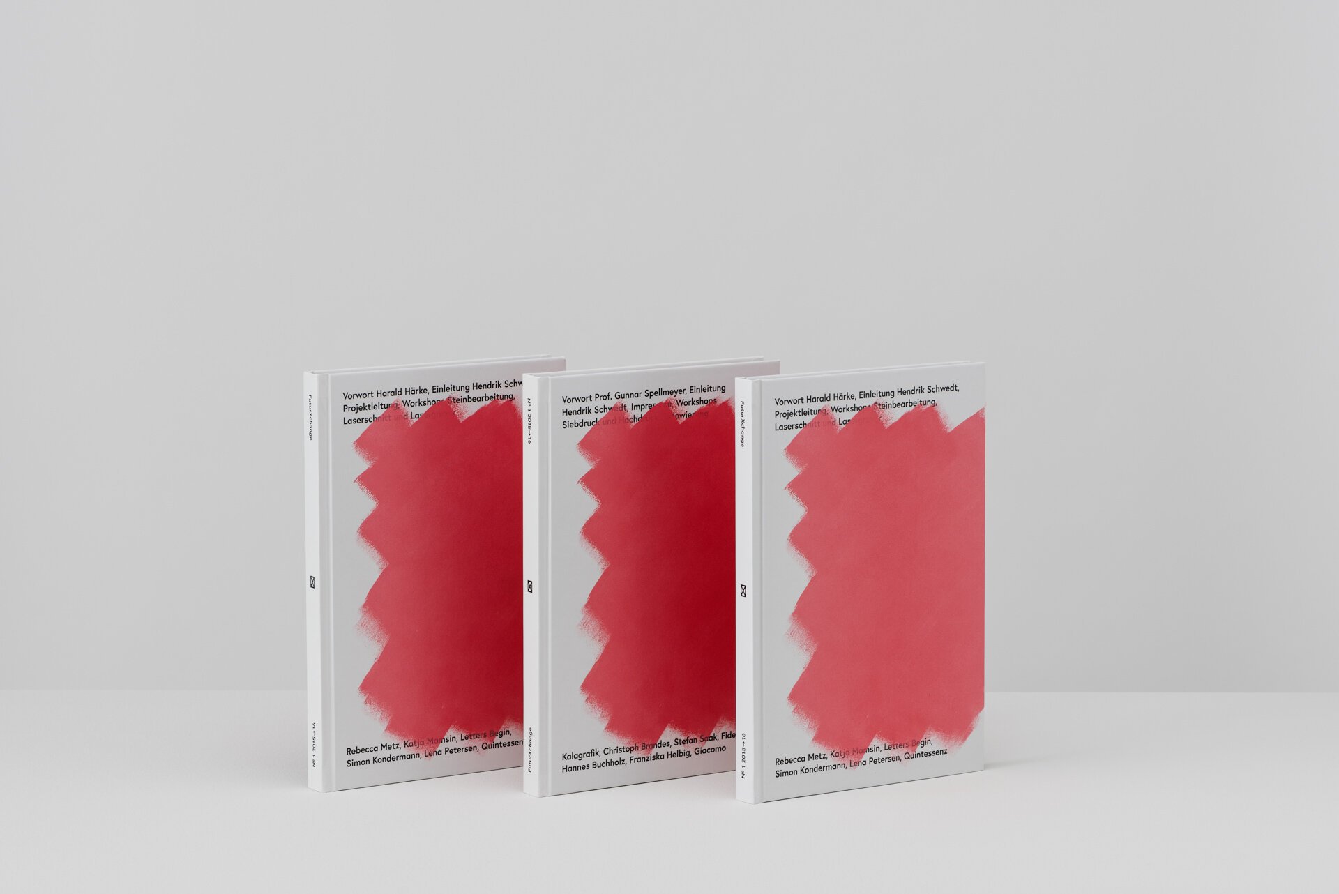
Futur X Change
Editorial Design, Lecturer, Workshop Initiator
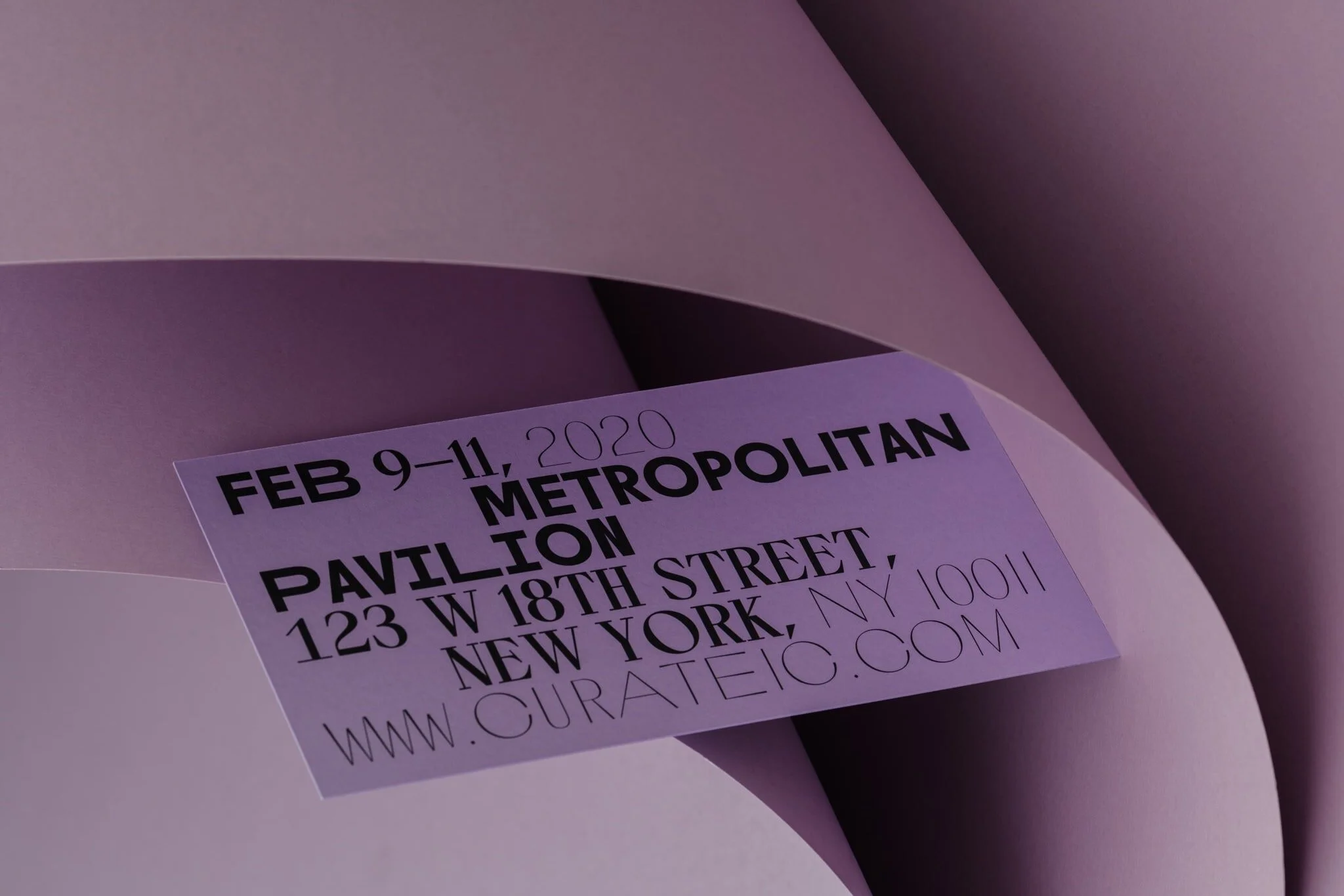
Curate Fashion Show
Branding, Exhibition Design, Website
Freies Theater Hannover
Branding, Catalogue, Corporate Design, Logo, Poster, Website
Studio Freed
Branding, Logo, Stationery
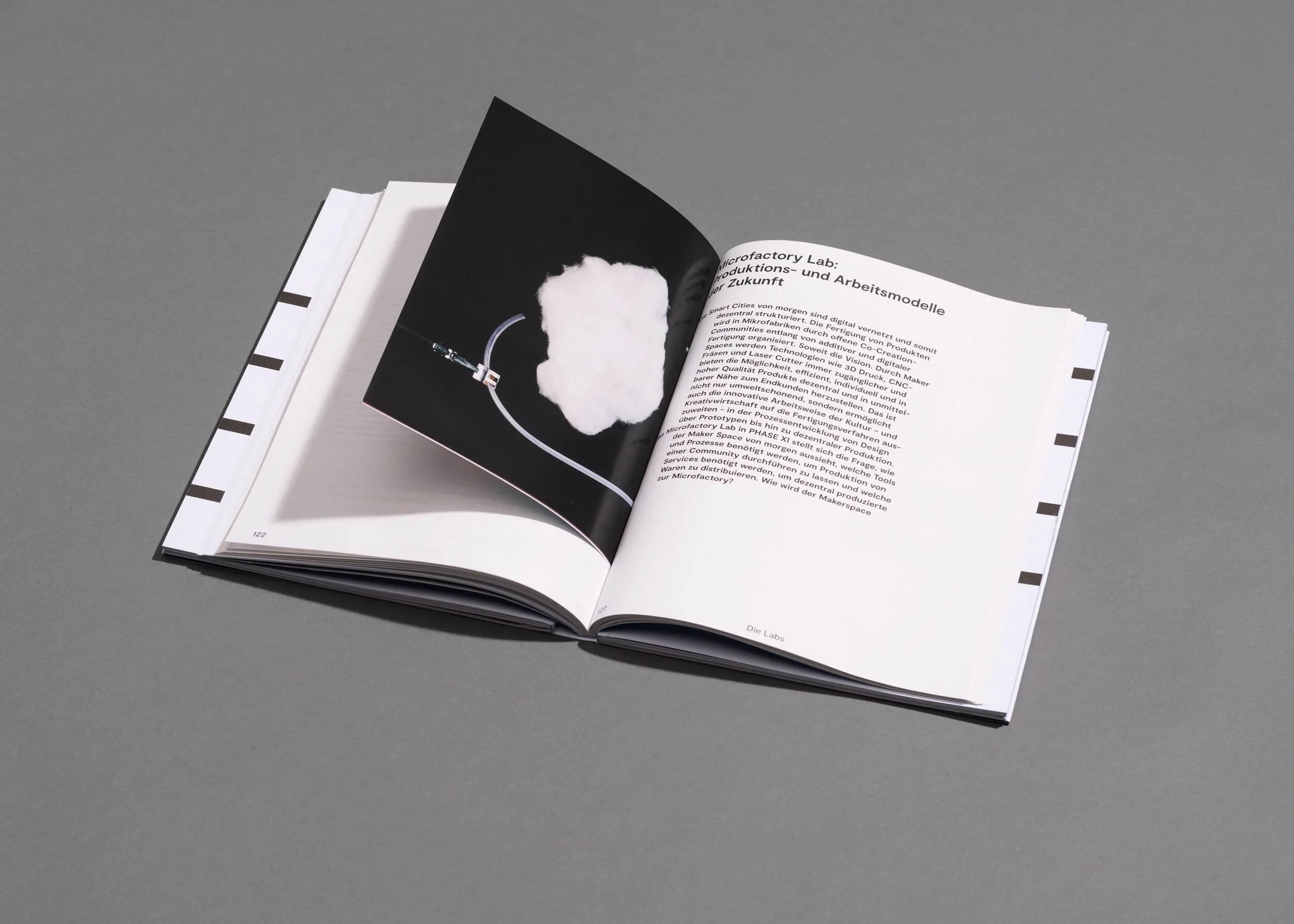
Phase XI
Editorial Design, Logo Design
Fullset
Logo
Rudolph Schelling Webermann
Corporate Design, Stationery Design, Website
Endboss
Branding, Logo, Stationery Design, Website
Amerika?
Editorial Design