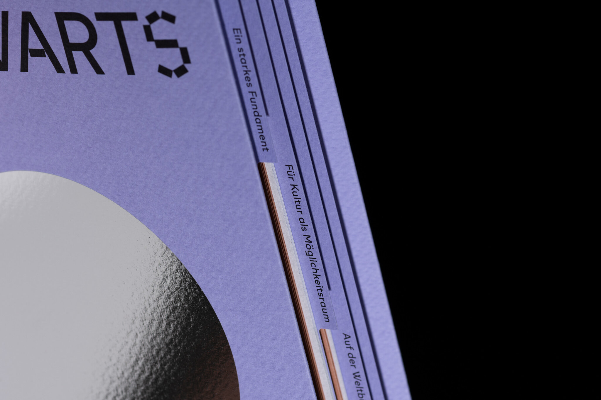
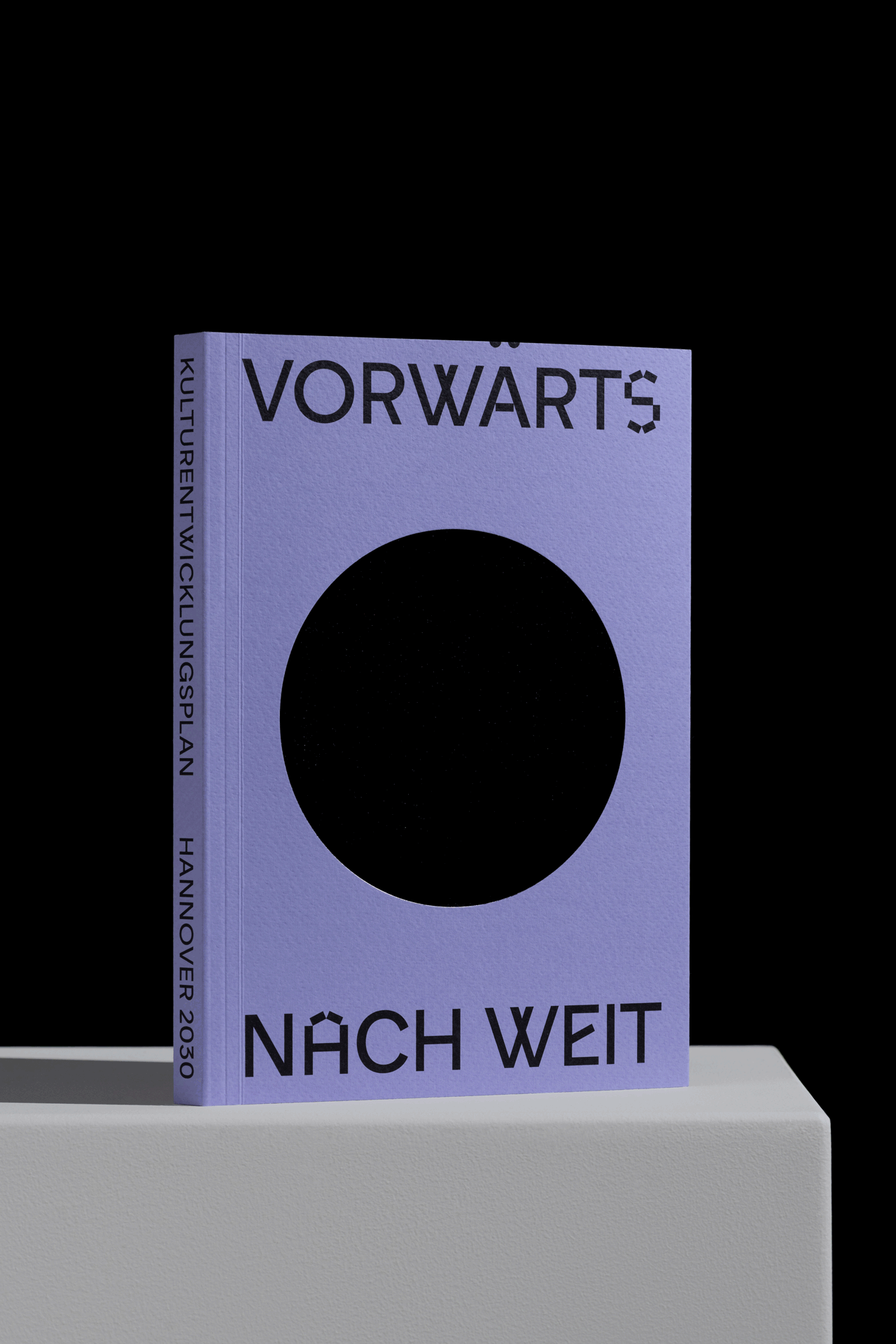
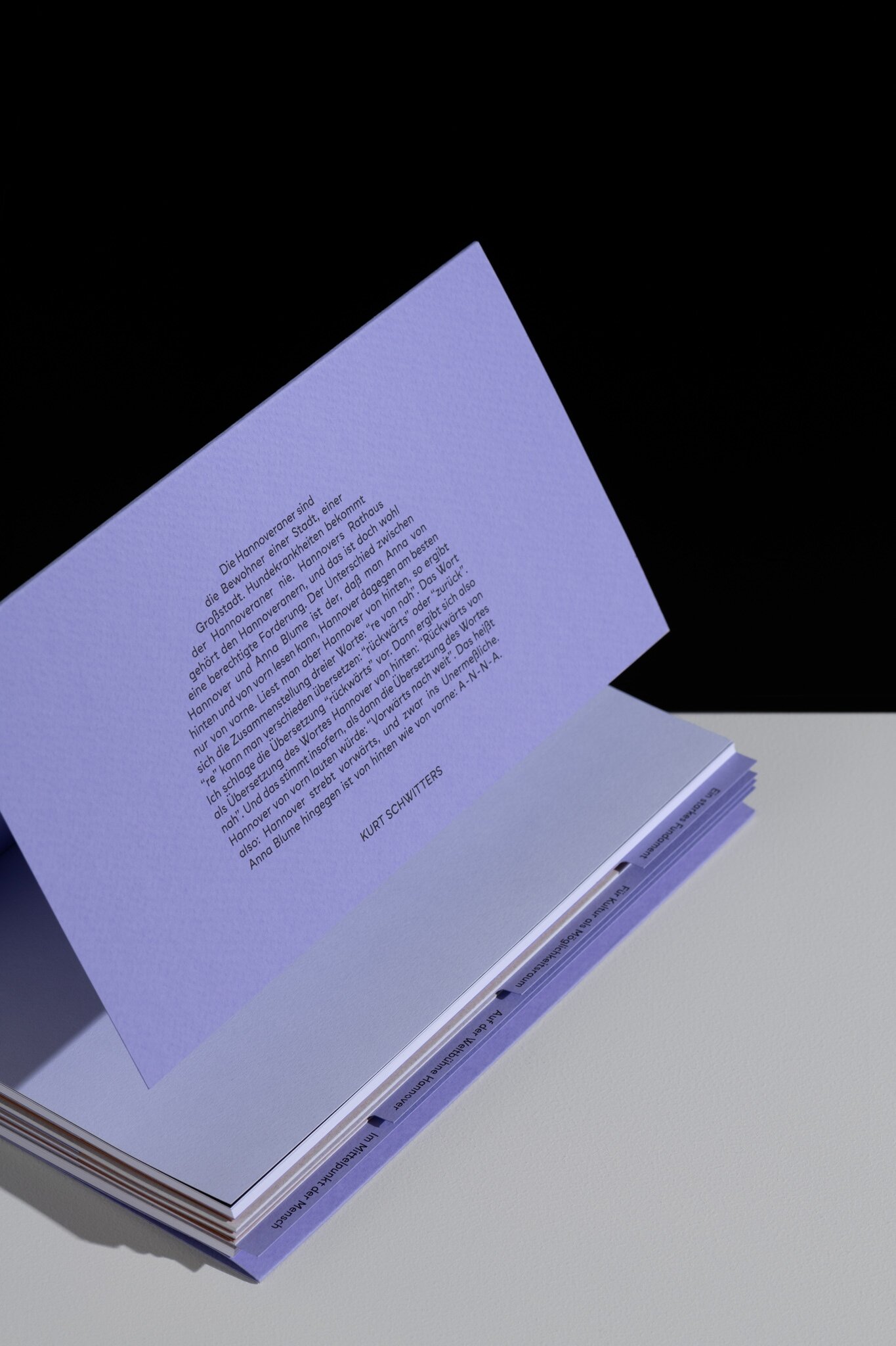
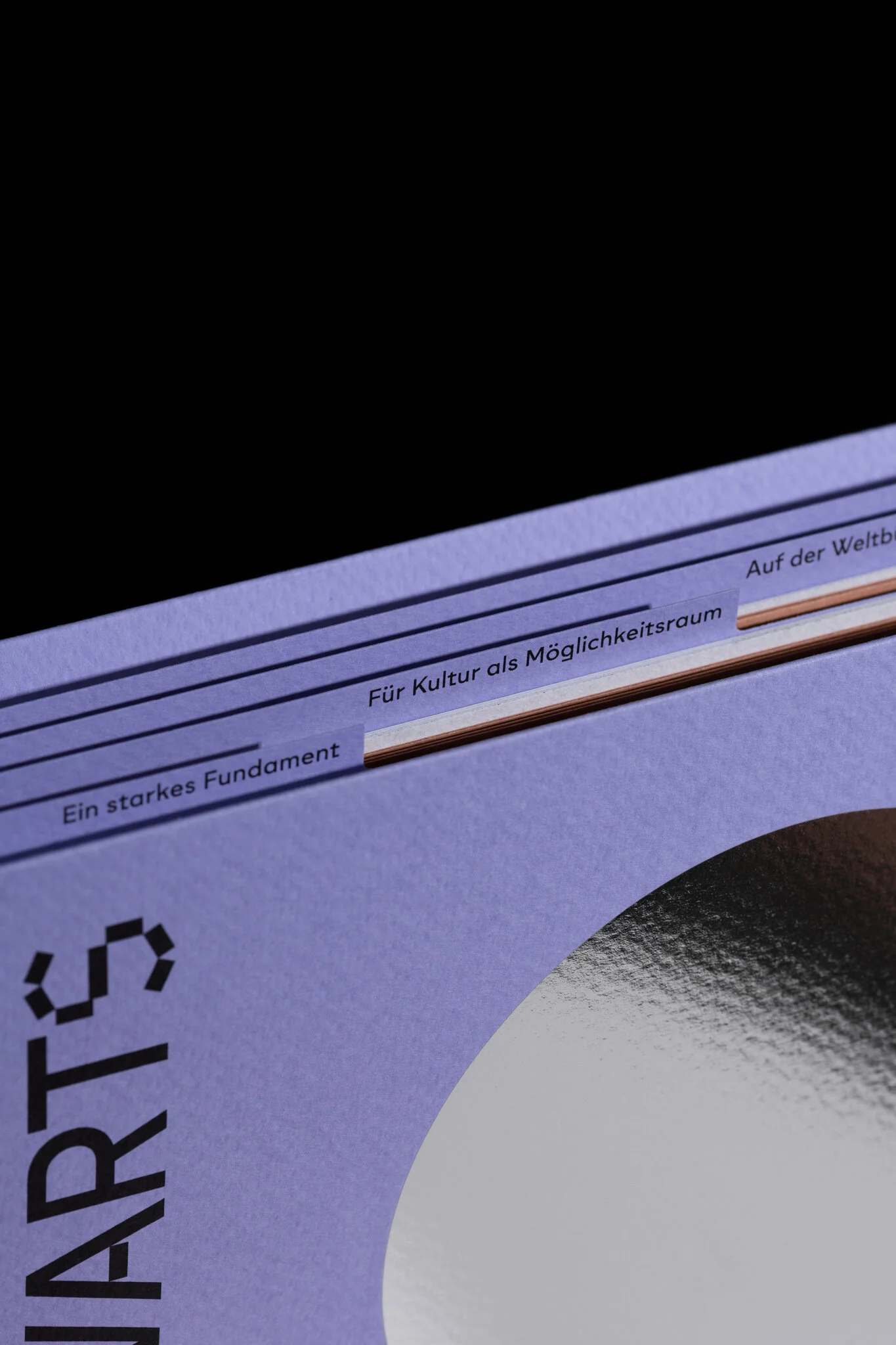
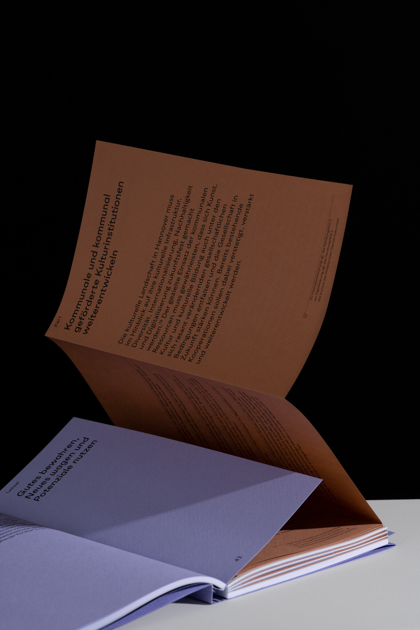


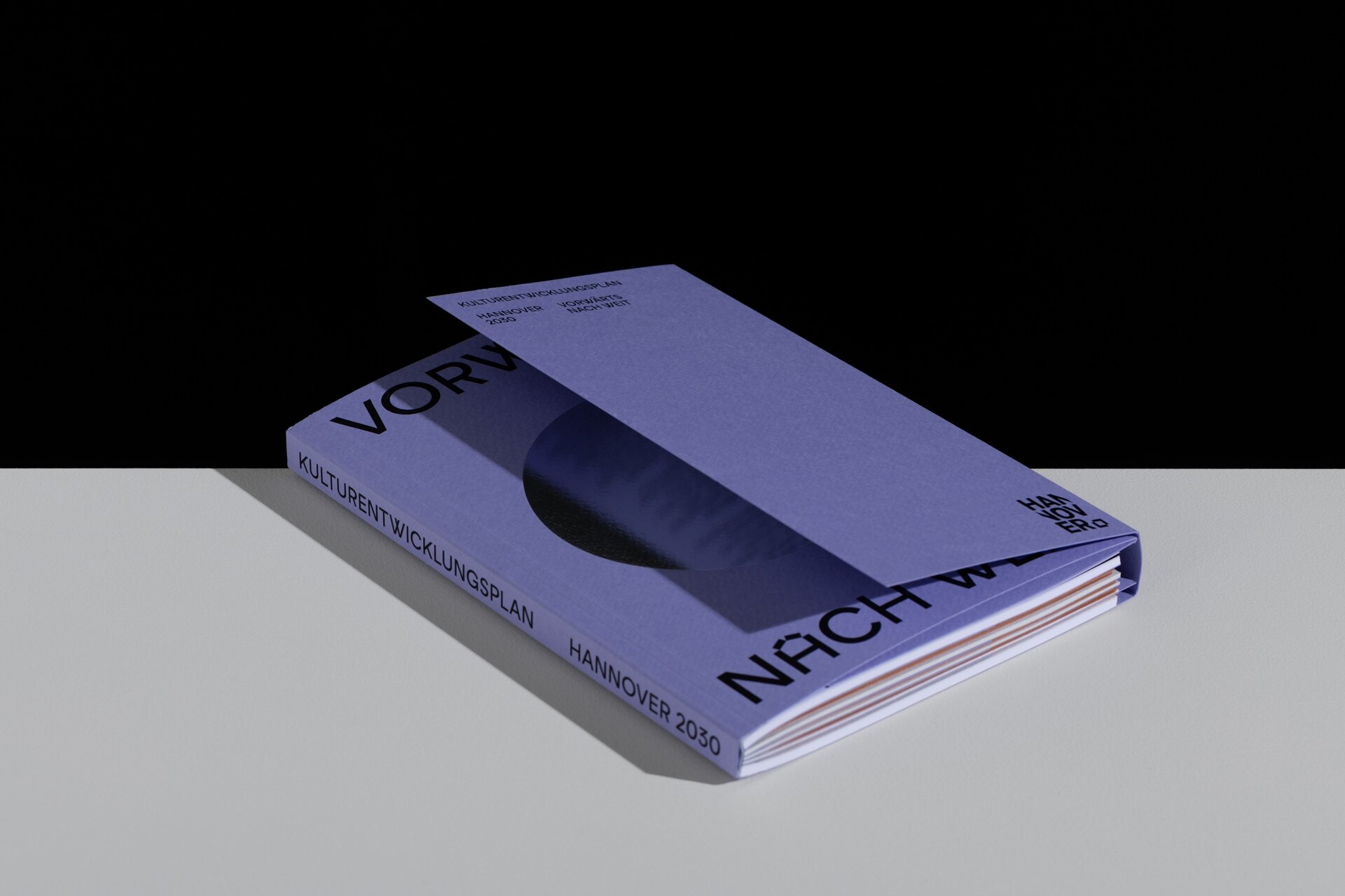
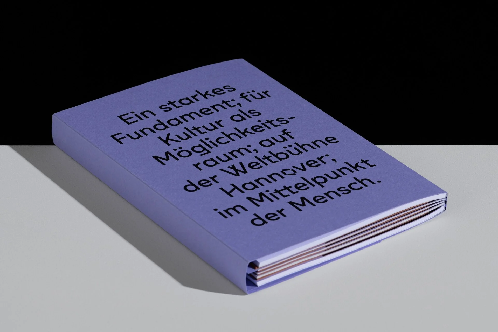

The design of this future-oriented publication is Kurt Schwitters inspired, but with a contemporary interpretation of the basic principles. Register seperate each field of action for a perfect orientation. Objectives and actions are fanfolded. All objectives are placed on shortened pages. FSC® certified papers in different weights, colors and sizes were used to separate chapters. Because of the silver hot-foil, the cover changes its appearance constantly. The custom font "Kurt" makes this publication fairly unique.